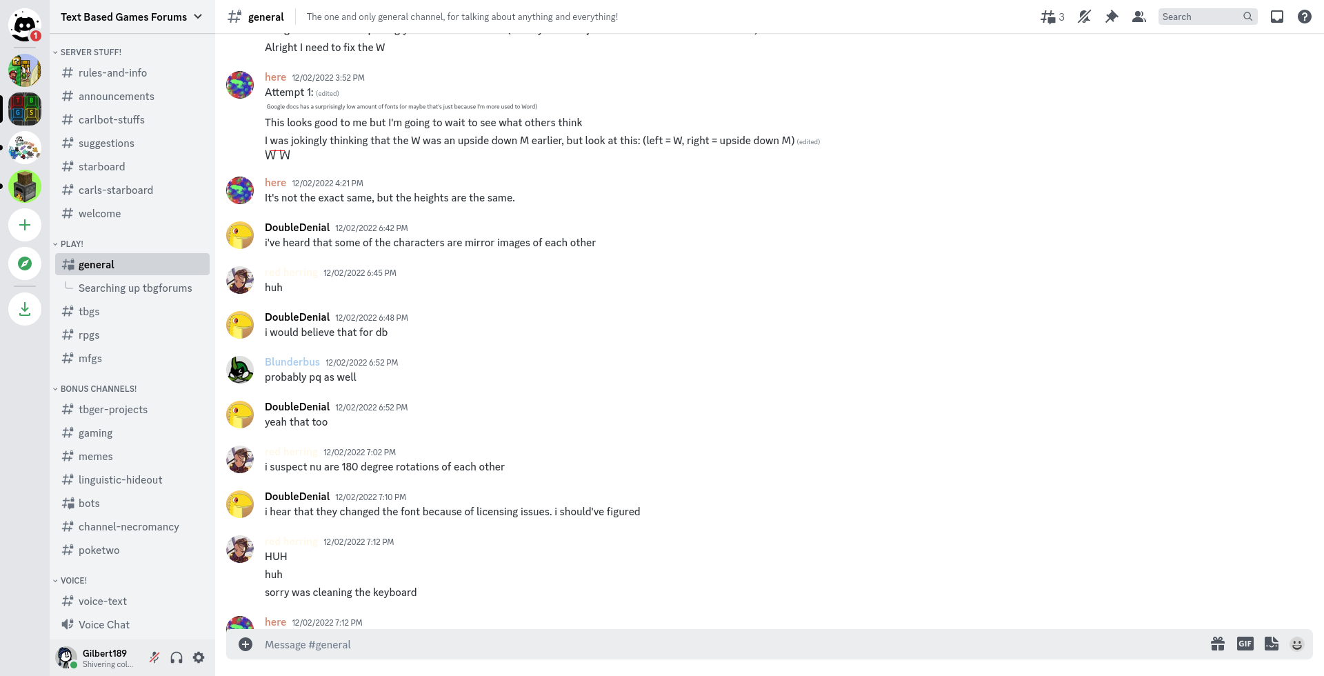
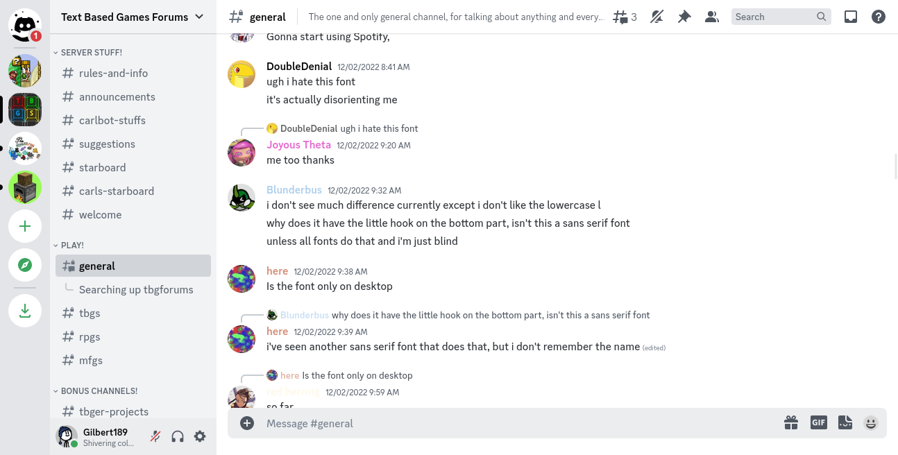
I actually liked gg sans so much I made it the default font for Darflen and wasteof2
Not in wasteof3 though, Space Grostek is already nice
comments
That isn't a very good font. It makes it harder for people with disabilities or larger screens to read.
Oh yeah, the font’s kinda thin.
But so does Montserat, Quicksand, and other fonts in https://fonts.google.com/?thickness=1
I think I can see why people had a hard time reading using the font.
Discord (that’s the client not the company) doesn’t really care what DPI the screen uses, it always uses 16px or something similar (technically on the CSS it says 100%, though I’m not sure the relationship of that and the size). As such, really high DPI screens will have a really small text (well, according to my vision, yours may vary).

The thing that gg sans differs from other fonts (let’s say Noto Sans, that’s what Discord originally uses) is that some characters are bigger, but not thicker. As such, gg sans would look a little bit too thin for some people, and that could be the reason for the reduced legibility. Added the fact that most people use dark mode there and you get something that’s hard to read.
However, on my 15.5” 720p Lenovo IdeaPad screen, I didn’t find any difficulty on reading the texts. In fact, I even compared the font to JetBrains Mono, just on how… consistent the characters is.

Overall, I’d say the reviews on gg sans are quite mixed.
