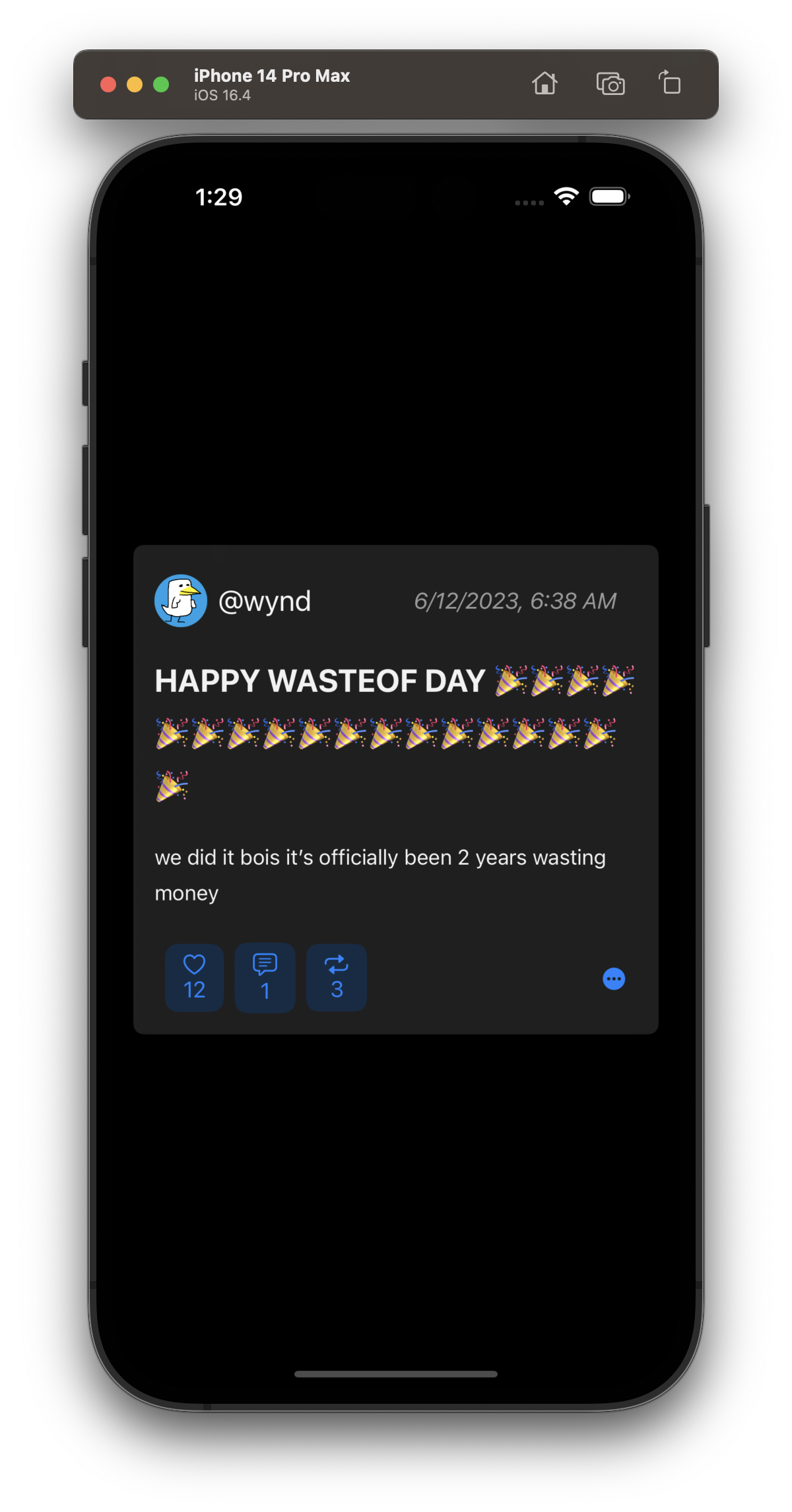
This is what a post is gonna look like (tentatively) in the iOS app:

This is not the full view btw, you’ll have to click on it to view comments and such
If you really want to see light mode, check edit history
comments (single view)
i like the light mode, but something feels off about how the actions (like, comment, repost) look on dark mode 
