imagine if
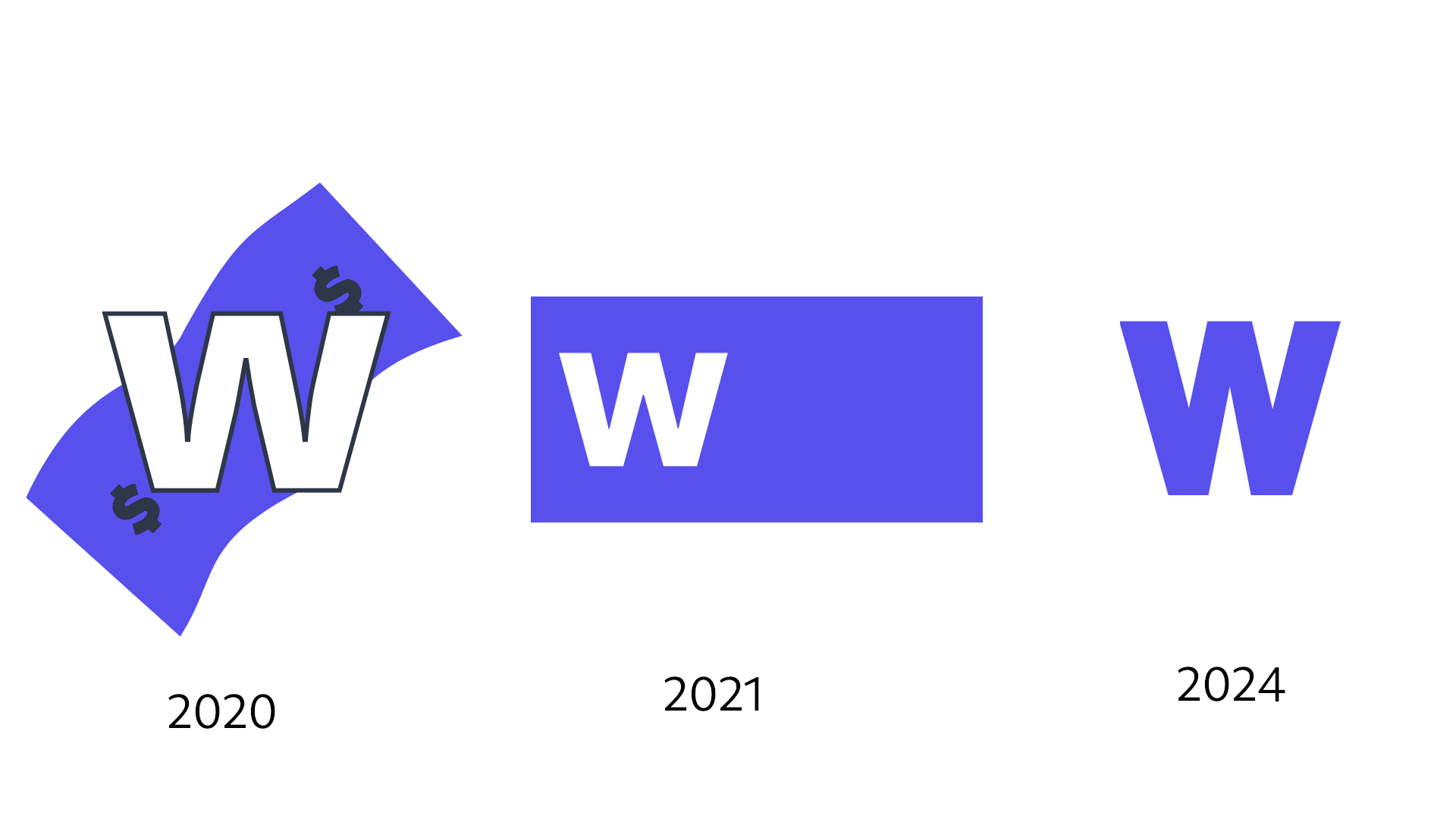
It’s almost impressive how Patreon has consistently been able to make their branding more and more generic, abstract and lacking in personality with each rebrand lmao

comments (single view)
it's not abstract enough, i can still clearly see it's a W, if we really wanna channel the new patreon logo we gotta make the w look like a paint blot