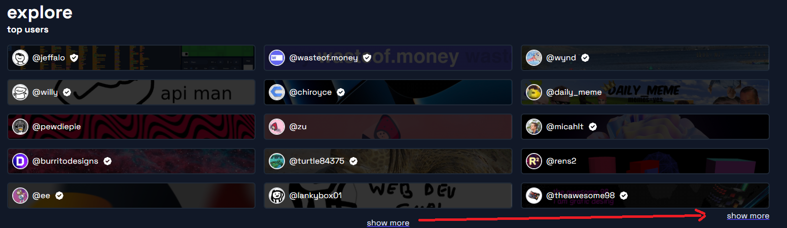
idea: “show more” on the explore page should be aligned to the right side of the page, closer to the user tiles. Here’s an example of what i mean:
idea: “show more” on the explore page should be aligned to the right side of the page, closer to the user tiles. Here’s an example of what i mean: