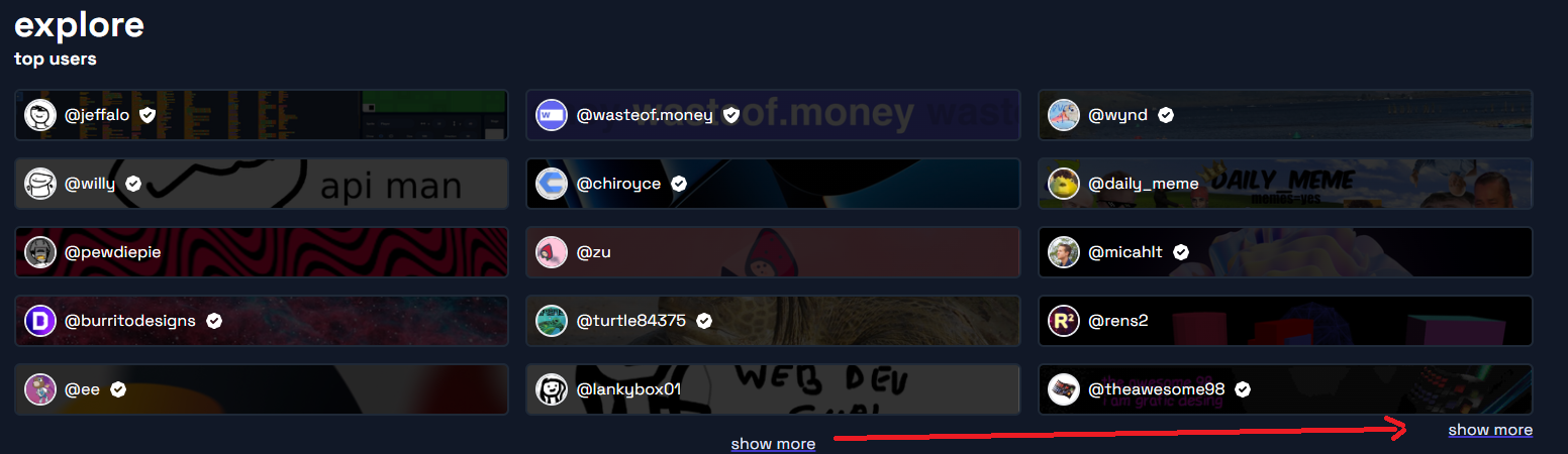
idea: “show more” on the explore page should be aligned to the right side of the page, closer to the user tiles. Here’s an example of what i mean:

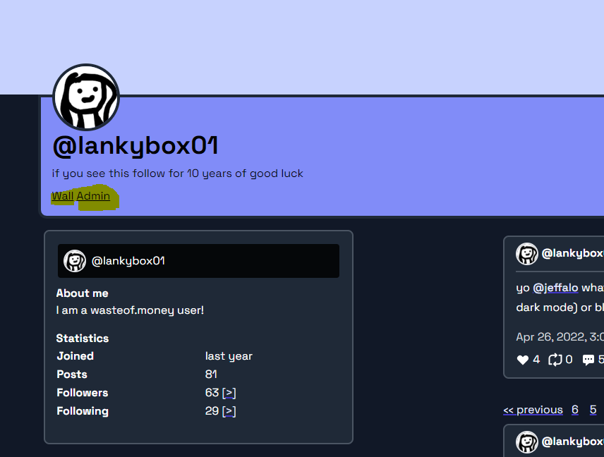

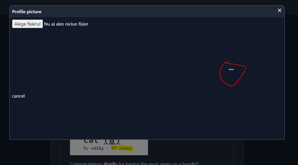
layout bug - pretty sure that dot is supposed to be in the post, not in the modal (when i click it it gives me post options)
Is it worth it to come back to scratch? Should I just stay on the brink of minecraft modding? (I am actually @9gr for some reason)
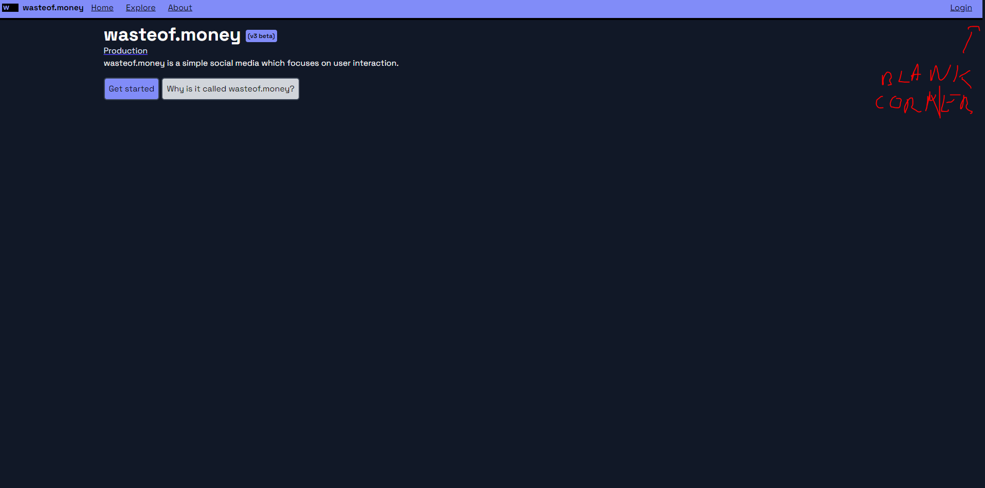
it’s the same on wasteof2. i need space for the scrollbar, or else the page jumps around. fortunately theres a new css feature that should fix this soon