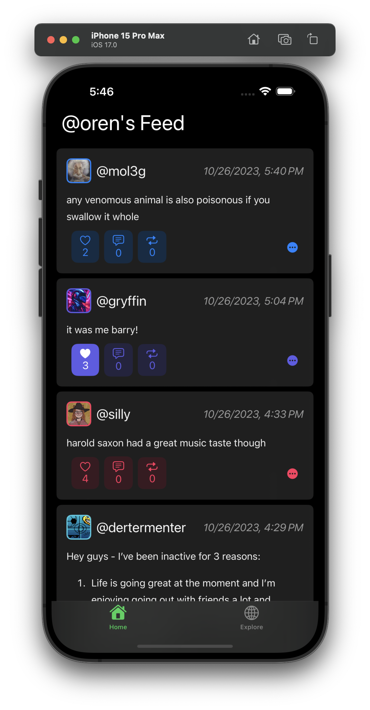
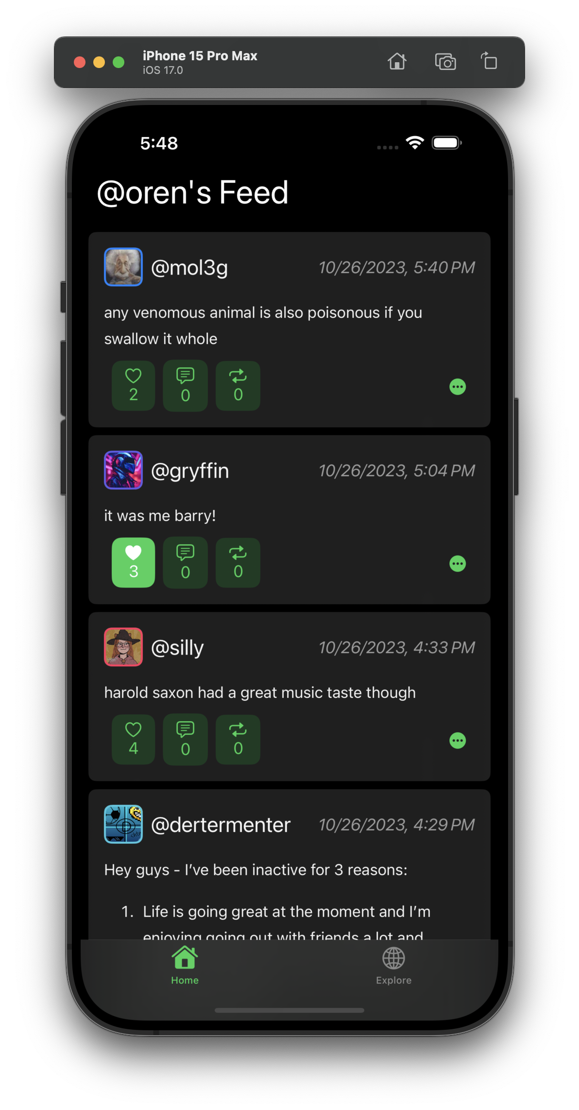
Which looks better?
A:

B:

On A, I use the user’s profile color as the accent color for the buttons. On B, I use the app’s accent color.
Oct 26, 2023, 9:50 PM
12
0
19
comments (single view)
I’d say A, fits in with wasteof4 and android app which also uses this on profiles