Which looks better?
A:
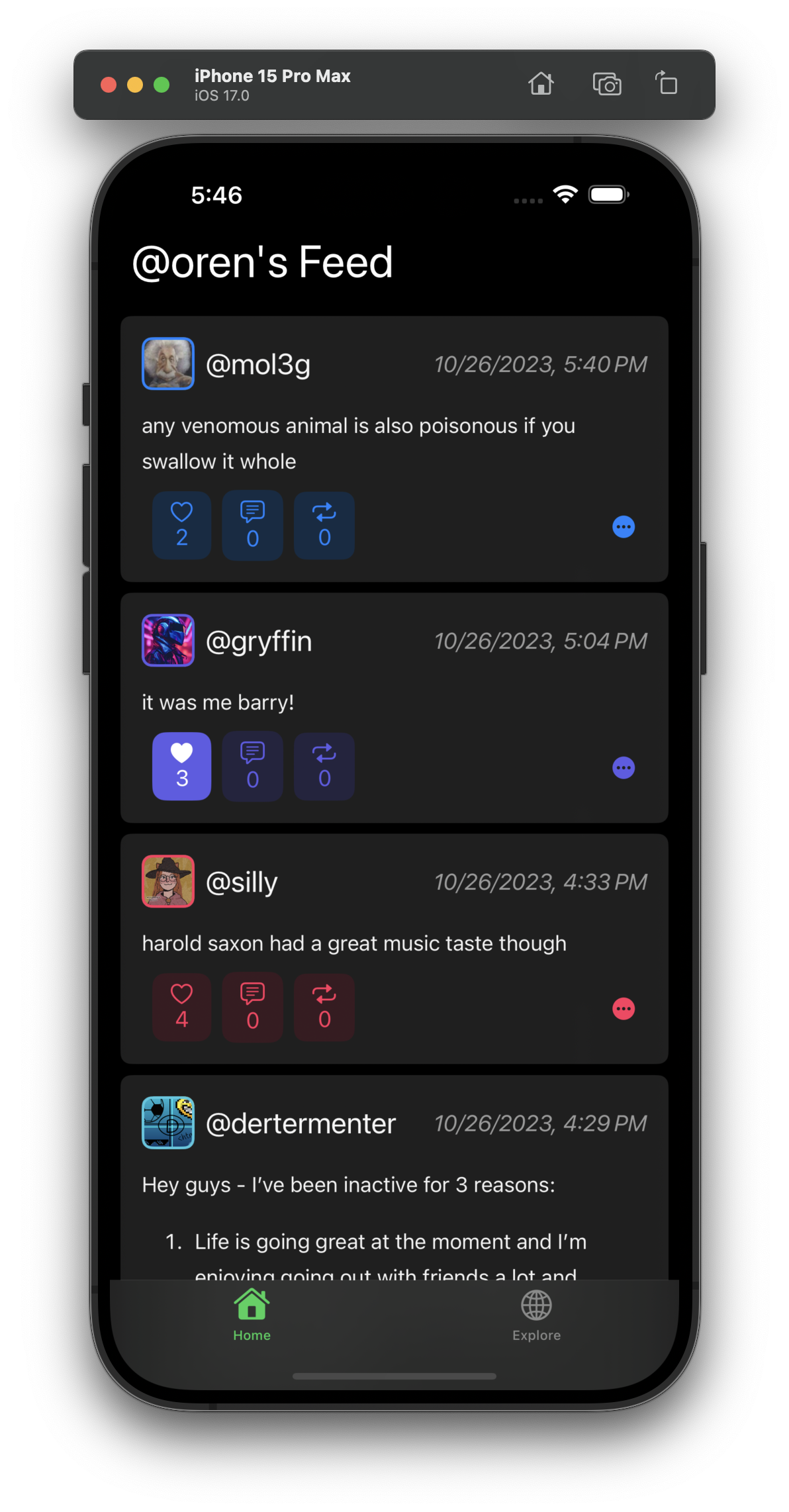
B:
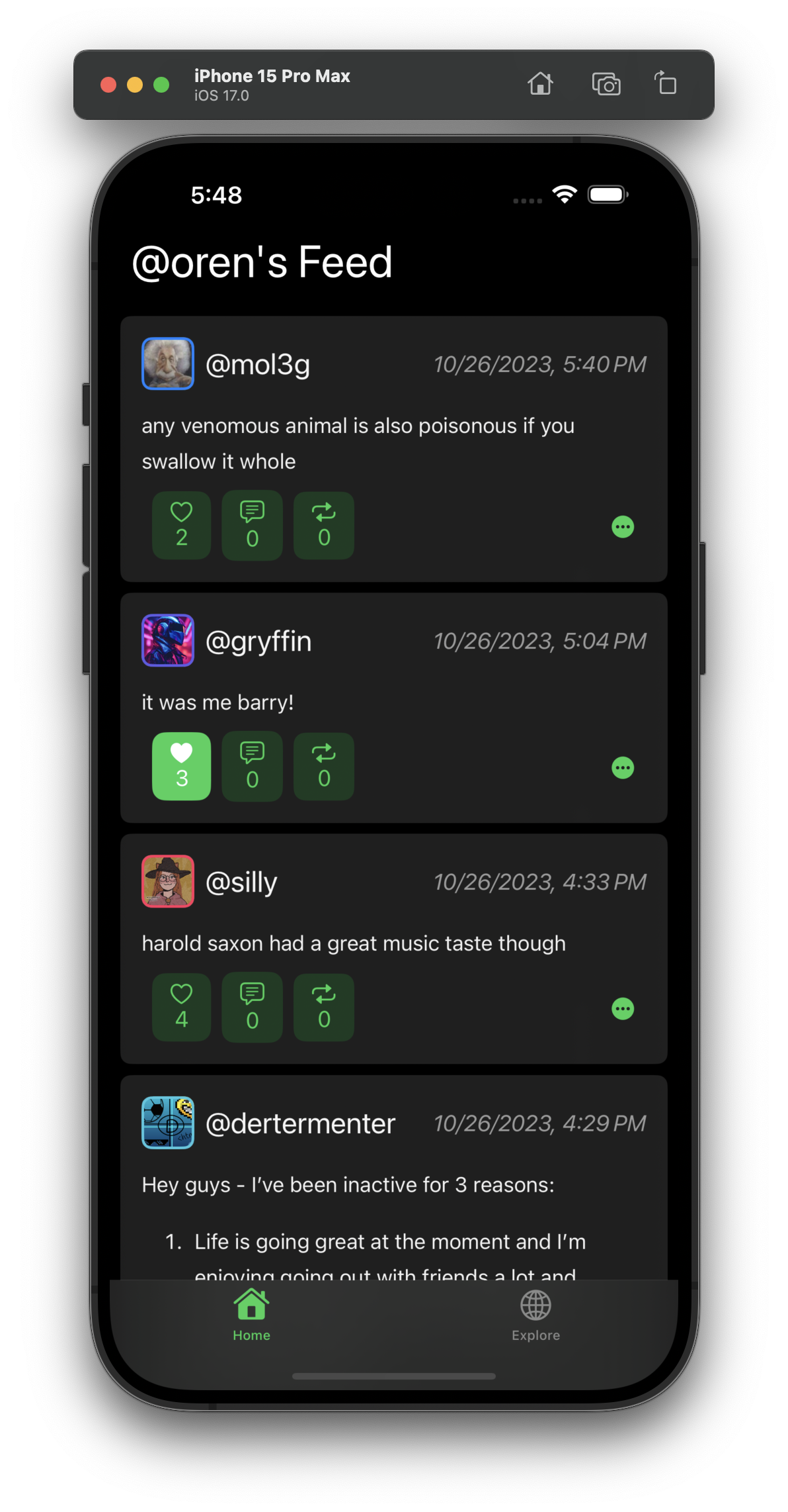
On A, I use the user’s profile color as the accent color for the buttons. On B, I use the app’s accent color.
Oct 26, 2023, 9:50 PM
12
0
19
comments

A
also would the app’s accent color change based on your profile color, or would it be separate or completely unchangable
I guess it could, but I would have to get different colored app icons and such. If it did do that, it would match your profile color.
A
also just realized you follow me thanks
also do reposts not show yet
Reposts don’t show yet due to some goofy thing with type safety in Swift, I’m working on it

I’d say A, fits in with wasteof4 and android app which also uses this on profiles