comments (single view)
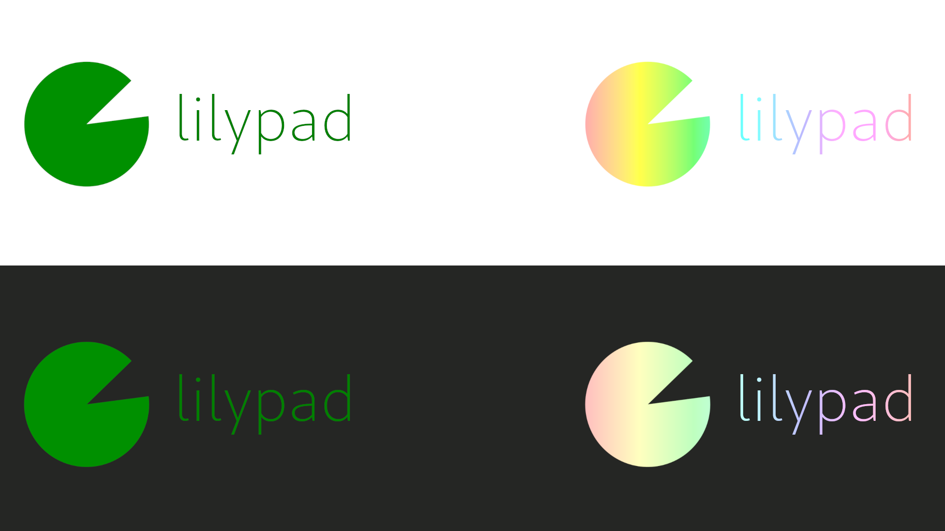
nice, a few thoughts tho: 1. try making the font bolder to compliment the weight of the logo, it'll give it a more balanced look 2. Try making the gradient more vibrant with some more easily readable colours
thanks for the tip, my brain just thinks “thin font = good”
yeah, i couldn't figure out a way to do that at the time but i can try
no worries, you could try solid colours instead? they’re easier to work with and allow you to make it work on both light and dark backgrounds more consistently!


