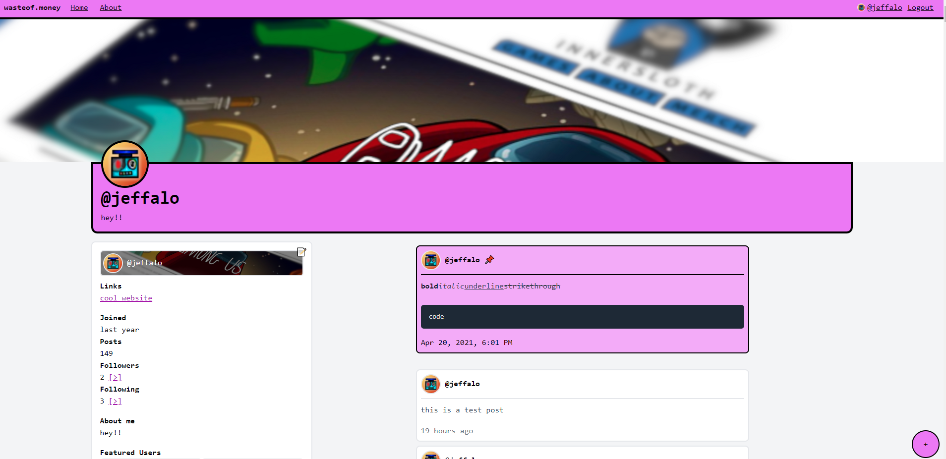
profile colours:
you get to choose the colour your profile appears in. the rest of the site will be the same colour (except for profiles)

Apr 14, 2022, 8:55 AM
25
2
45
comments
I think that if you stay with the neutral grayish-blue and white theme colors then it wouldn’t be an issue. Your site though :P
Super neat concept! Imo it would be a lot more consistent if the navbar was the same color as the rest of the site though.
Nice but maybe the black outline could be a darker version of the profile color also again better font
I like the font but yeah the border colour i’d suggest to be either that or grey and thinner