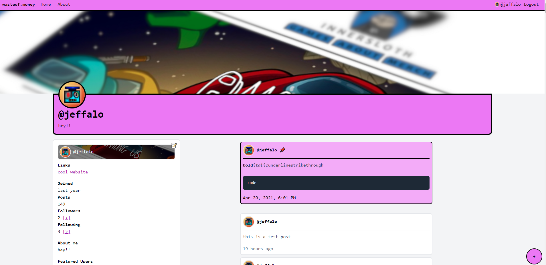
profile colours:

you get to choose the colour your profile appears in. the rest of the site will be the same colour (except for profiles)
comments

Thats great! But why only the profile? Make some whole site themes

this reminds me of tumblr đź’€

but much worse

Epic! I will encourage my friends to sign up! :)

lets go!

You seem to be online… Are you working on WOM 3?

the outlines are painful but otherwise coolio

What’s this

That banner is extremely sus innersloth themed (no among us here)

this will be pog

when will wo3 come out??

goal is to have a functional preview by next week. no promises though.

development will slowdown a ton by the 18th of april, because my school starts up again and i won’t have much time to work on it

oh okay!

You forgot to link the explore page

it doesn’t exist yet!

reminds me of newgrounds and their profile colors

Kinda sus…

JEFFALOS A SUSSY BAKA

Are the screenshots just cropped weirdly or is the navbar text really misaligned like that

update: i asked jeffalo and thankfully it’s just cropping

will the line spacing still be

the size of my forehead?

it’s like each line break is two of them, i dislike it.

Load more comments