@jeffalo you should definitely use the first one. Slowly make it more and more complex until it’s a 3D render of a blue-purple color dollar bill and something molded into the shape of a W
imagine if
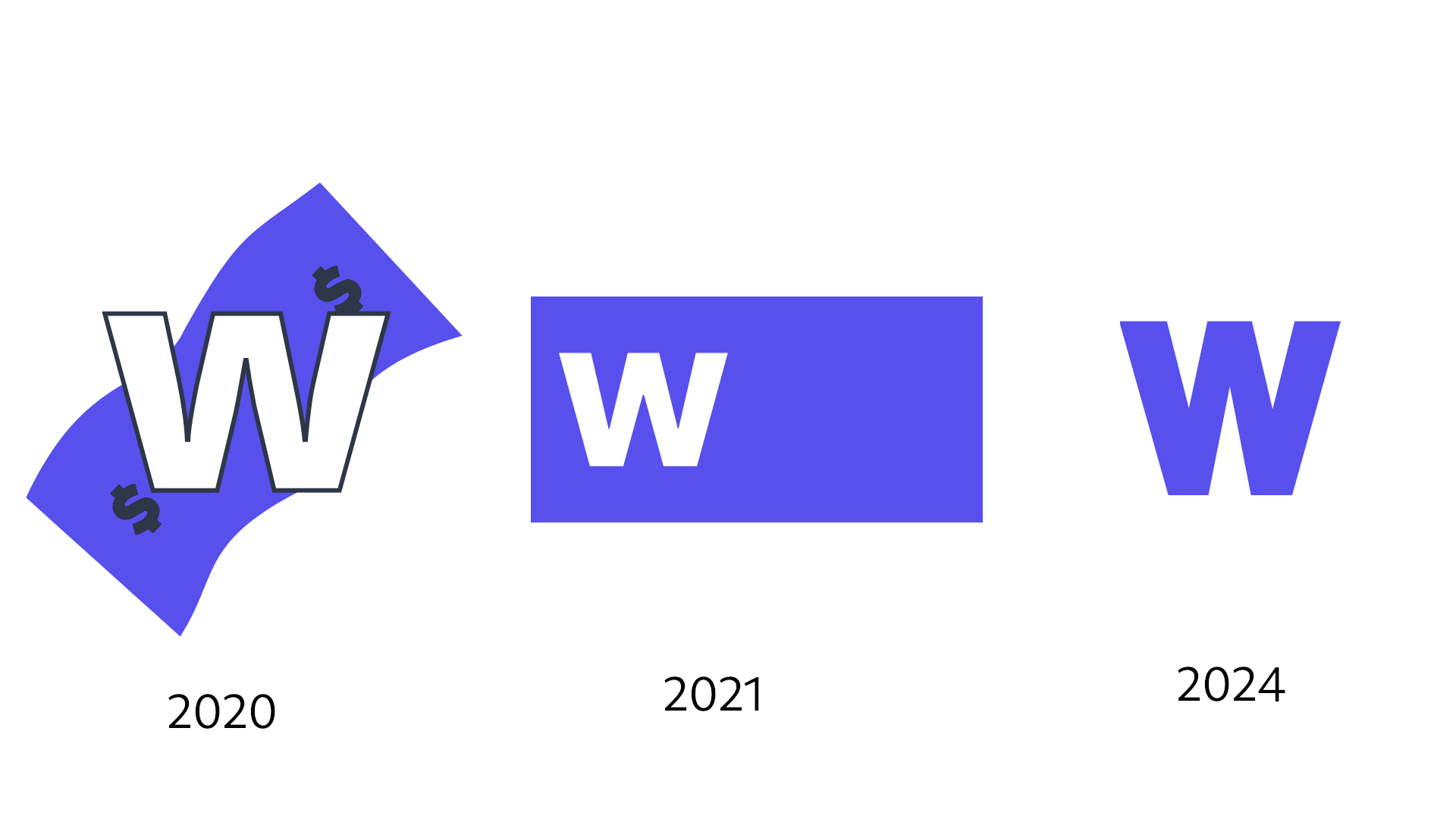
It’s almost impressive how Patreon has consistently been able to make their branding more and more generic, abstract and lacking in personality with each rebrand lmao

Oct 6, 2023, 7:42 PM
22
3
14
Oct 6, 2023, 9:41 PM
13
2
5
Oct 6, 2023, 9:46 PM
5
0
0