More stuff—
There appears to be some kind of bugginess between the code markup and other things, when you try to turn some things to code it will revert other stuff back to normal text.
If you type a long enough post, the markup will disappear and you’ll have to scroll up to change the formatting. It would be helpful if the bar followed you so that you wouldn’t have to scroll down.
It would be cool if you could use formatting in your About Me
Also, I just noticed that when you’re looking through followers, switching pages listing them causes a slight delay in which the next page’s usernames are visible, but they still have the profile pictures and banners of the users on the previous page.
I have three things about the beta (mostly design-related stuff):
On the homepage, the login thing appears over my feed even though I’ve already logged in
The header is a little blinding at least in dark mode, I honestly preferred the more muted color scheme from the normal wasteof
On the about page, it might be cool to scatter the posts across the screen horizontally as well as vertically so that it matches the header. Alternatively, you could change the margins on the header so that it matches that of the post borders. Mostly just margin consistency but this is pretty minor.
Also on the topic of margins, maybe adding some extra stuff there would be cool and help fill some of the empty space.
Please take this stuff with a grain of salt because I’m not sure how feasible some of this is to program.
unique thing: typing @username/anything links to the page, so @example/wall returns example’s wall, and @example/followers returns followers of example
Also remove admin button in nav because it doesn’t go to that one youtube video anymore, and make /admin return a 401 instead of 404
backend(ish) suggestion:
[for admins] user objects could be saved with an extra array called “vanity“ or “slugs” or something where admins could add extra url vanities for users, that redirect to that user, e.g. the official wasteof account could have the vanities /users/wasteof and /users/admin that redirect to @wasteof.money. this would mean people could fine the admin account without finding other accounts that look like staff because of their username. This could also be nice if you want to get /users/jeffalobob to go to /users/jeffalo without making a whole other account that has the link in its bio or something. I was thinking this only as an admin tool, but It could potentially be a feature with a limit so people don’t have to create accounts with similar usernames to not be confused.
Vanities could only be usernames that aren’t in use or are banned for something like impersonation of another account.
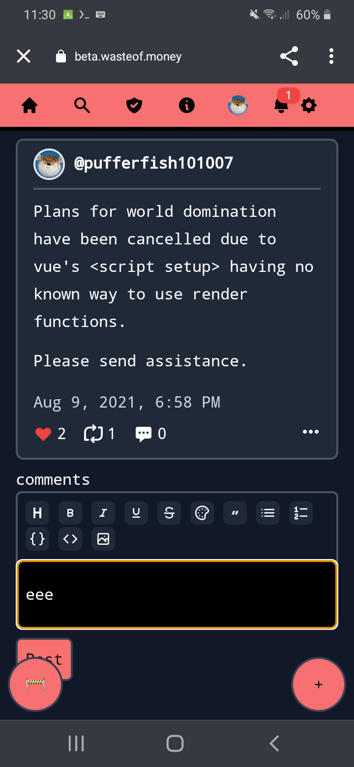
minor qualm - beta button covers post button sometimes (it’s worse on longer posts):

/chat page didn’t make it in the beta… also I can’t “load more“ in my feed once I reached the bottom as the button is too there