i changed the font of the website!
it should still match the “codey”/monospace style, but it’s now a little more sans-serify.
let me know what you think.
May 20, 2022, 6:11 PM
14 3 38
comments
I think that this font looks a lot better, but I find it a bit more difficult to read - I'm not quite sure why.
also I'm not a fan of the brackets (but I'm sure I'll get used to it)
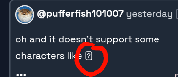
that question mark should have been U+20B1 - a fallback would be ideal
what browser/device are you on? on chrome windows 10 i see a P with lines through it
it’s funny because many people told me that the monospace was practically unreadable
actually idk about this new font it’s kinda weird. I guess i’m just used to the previous one