comments
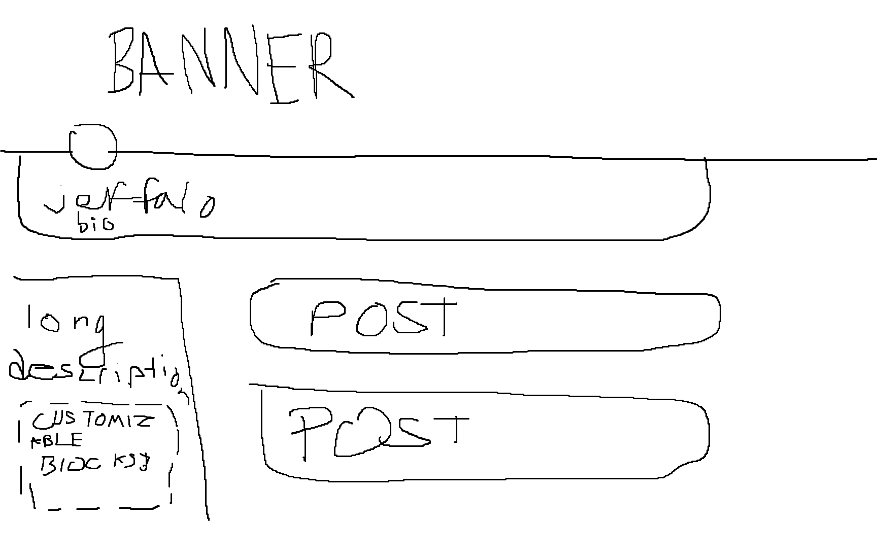
would the sidebar scroll with the screen or would it stay at the top
i like what i’m seeing so far from the redesign! i certainly agree it will not be to everyones tastes, especially compared to the current design. but i personally think it is quite interesting with the direction you’re taking with the new ui. one question i have is if there will be a dark theme?


customizable blocks. perhaps users can drag/drop some things around. make profile unique:tm:
yeah the stats is currently one block. but maybe i’ll add settings for it? i do not know yet

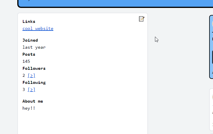
I like the look of that alot. Will we be able to make our own profile buttons/links??
Are the “[>]” buttons placeholders? If nothing else, I think they would look nicer without the underline